The Rise of Organic Minimalism: Why Monochromatic Earth Tones Dominate 2026
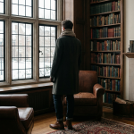
As I sit in the front row of this season’s most anticipated shows across Paris and Milan, one shift is undeniably clear: the era of loud, chaotic fashion has officially given way to what I call “Organic Minimalism.” I’ve spent over a decade forecasting global style trajectories, and the absolute dominance of monochromatic earth tones in 2026 isn’t just a fleeting aesthetic—it’s a psychological response to our hyper-digital, fast-paced world. We are collectively craving a sense of grounding, and designers are delivering it through breathtaking, head-to-toe canvases of terracotta, muted sage, and warm desert sand.
What fascinates me most about this movement is how it forces a masterclass in texture. When I strip away the distraction of contrasting colors, the garment’s craftsmanship has nowhere to hide. I’m seeing visionary designers layer raw, unspun silk over heavy ribbed knitwear, or pair butter-soft suede with structured organic linen—all strictly confined to the exact same shade of deep umber or wet clay. It’s visually arresting because of its quiet confidence. If you want to understand the true catalyst of this trend, you need only look at how sustainable fabric innovations have advanced this year. We can finally achieve these rich, natural hues using botanical dyes without the harsh chemical footprint, aligning perfectly with the ethos of the modern, conscious consumer.

I firmly believe that the 2026 iteration of “quiet luxury” is rooted directly in the soil. It’s no longer merely about avoiding overt logos; it’s about embodying the serene, unfiltered palette of nature itself. When I curate my own seasonal wardrobe, or when I advise my private styling clients, I always emphasize that building a monochromatic earth-tone look is an exercise in intentionality. You aren’t just putting on clothes; you are wrapping yourself in a wearable sanctuary of calm.
Essential Color Palettes: From Raw Umber to Mossy Sediments
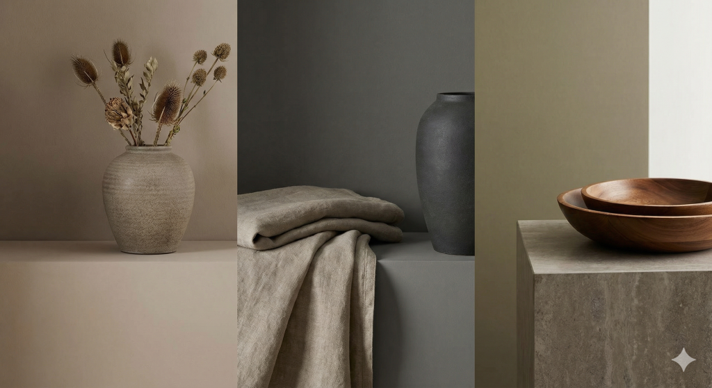
When I curate a collection rooted in earth tones, I am not just picking colors; I am layering a narrative of organic permanence. This season, the shift moves away from the safe, sandy beiges of the past toward a more visceral, grounded intensity. I find myself gravitating toward the profound depth of Raw Umber. It serves as the ultimate anchor for a monochromatic look—a shade that feels more “expensive” than standard brown because of its cooler, slightly desaturated undertones. I recommend utilizing this in heavy-weight wools or structured leathers to emphasize its architectural strength.
To prevent a monochromatic palette from feeling flat, I introduce what I call the “sedimentary transition.” This involves bleeding Raw Umber into the murky, sophisticated world of Mossy Sediments. These aren’t your typical forest greens; they are complex, pigment-heavy hues that carry hints of gray and sulfur, mimicking the damp floor of an ancient woodland.
In my styling practice, the magic happens in the micro-tonal shifts between these two poles. I might pair a matte, Raw Umber silk trouser with a chunky-knit sweater in a deep, mossy sediment. The contrast isn’t found in the color—which remains harmoniously within the same terrestrial family—but in the tactile vibration of the fabrics. By sticking to these raw, unrefined pigments, the silhouette feels intentional and high-fashion, avoiding the “safari” clichés and instead leaning into a modern, minimalist ruggedness that feels entirely relevant for 2026.
Shifting from Beige: The New Depth of Terracotta and Ochre
For seasons, I watched as vanilla and beige dominated the runways, creating a minimalist but undeniably safe aesthetic. However, I am now witnessing a profound, much-needed shift in the monochromatic earth tone palette. We are moving away from those muted, passive neutrals and diving headfirst into the rich, sun-baked warmth of terracotta and the spicy, golden allure of ochre. It is a rebellion against the sterile, bringing blood and pulse back into our wardrobes.
In my recent styling sessions, I’ve found that layering these deeper pigments brings a visceral energy to a look that beige simply cannot achieve. Imagine a head-to-toe terracotta ensemble—a raw silk blouse tucked into high-waisted wool trousers, anchored by a structural leather boot in the exact same baked-clay hue. It is grounded yet fiercely commanding. If you observe the current direction of forward-thinking luxury houses, you will see exactly how these clay-inspired shades are redefining modern elegance with a distinctly architectural edge.

Ochre, on the other hand, introduces a touch of artisanal luxury that I am absolutely obsessed with this season. I frequently recommend pairing an oversized ochre cashmere coat with a matching bias-cut slip dress. The result is a silhouette that feels both opulent and deeply connected to nature, catching the autumn light in a way flat creams never could. It is my firm belief that these saturated earth tones are not just a fleeting phase, but a bold evolution of the monochromatic trend, offering my clients a richer, more emotional connection to their daily uniforms.
Cool Earth Tones: Incorporating Slate Grey and Muddy Olives
I find that there is a profound, quiet power in shifting away from the warmth of terracotta and sand toward the more stoic, grounded palette of slate greys and muddy olives. When I approach a monochromatic look within this “cool earth” spectrum, I’m not just looking for a single color match; I’m looking for a dialogue between textures that prevents the outfit from feeling flat or clinical. These shades are the anchors of the modern naturalist’s wardrobe, offering a sophisticated edge that feels both utilitarian and ethereal.
To master this, I suggest leaning heavily into the industrial-meets-organic aesthetic. Imagine a heavy, charcoal-adjacent slate wool overcoat paired with silk trousers in the same tonal family; the contrast in light reflection creates depth where the hue does not. When I integrate muddy olives, I treat them as the “new neutral.” It’s a color that carries the weight of heritage—think waxed canvas or distressed leather—but when executed in a head-to-toe monochromatic silhouette, it transforms into something incredibly sleek and avant-garde.
For those looking to visualize how these tones interact with structural design, consider how a minimalist silhouette benefits from these desaturated pigments:
| Element | The Slate Approach | The Muddy Olive Approach |
|---|---|---|
| Key Texture | Brushed cashmere or matte tech-fabrics. | Heavy linens or tumbled nubuck leather. |
| Visual Vibe | Urban, architectural, and serene. | Grounded, rugged, and intentional. |
I often tell my clients that the secret to these cool earth tones lies in their understated complexity. A slate grey isn’t just grey; it has whispers of blue and flint. A muddy olive isn’t just green; it contains traces of brown and ash. By layering these specific nuances, you create an outfit that doesn’t just sit on the body—it commands the space with a disciplined, rhythmic elegance.
Texture Over Contrast: Mastering Depth in Single-Hue Dressing
When I conceptualize a look rooted entirely in a single earth tone—say, a rich, roasted espresso or a soft, sun-baked clay—my immediate challenge isn’t the color itself, but the risk of visual flatness. I always tell my styling clients that when you strip away the friction of color contrast, you absolutely must replace it with the friction of touch. Texture becomes your new color wheel. By layering varying material weights, weaves, and finishes, I can create an optical depth that keeps the eye moving across the silhouette, proving that a single hue is anything but monotonous.
My absolute favorite approach to mastering this depth is what I call the “matte-shine” or “hard-soft” juxtaposition. Imagine pairing a buttery, light camel suede jacket over a delicately ribbed cashmere turtleneck, finished with crisp, structural cotton-twill trousers. All three pieces exist within the exact same sandy color family, yet the outfit feels incredibly dynamic. The ambient light bounces off the suede differently than it absorbs into the matte cashmere. For those wanting to push this styling trick further, I highly recommend exploring how top designers use unexpected, tactile materials to build architectural interest; you can often see this executed flawlessly in current seasonal runway reports, where high-gloss leathers are layered alongside raw, unspun wools.

Just look at how the interplay of an aggressive, chunky cable-knit against a smooth, flowing silk skirt in an identical olive green shade creates a natural contouring effect on the body without needing a single drop of contrasting dye. I’ve found that this tactile interplay doesn’t just elevate the visual aesthetic; it elevates the wearer’s physical experience. You are no longer just wearing a monochromatic palette; you are wearing an entire tactile landscape. Mastering this textural layering is, in my professional opinion, the true hallmark of elevated, luxurious earth-tone dressing.
Fabric Play: Pairing Heavy Raw Linens with Translucent Silk Organza
When I approach a monochromatic earth-toned palette, my primary mission is to prevent the look from feeling flat or “muddy.” The secret weapon in my arsenal is the deliberate, almost aggressive, juxtaposition of weights. I find that nothing elevates a desert-sand or clay-hued ensemble quite like the architectural tension between heavy raw linens and translucent silk organza.
I often start with a base of raw linen—it’s honest, tactile, and carries a structural integrity that feels grounded in the earth. The slubby texture of the linen absorbs light, giving those deep umbers and toasted siennas a matte, lived-in quality. But to stop there would be a missed opportunity. I love to layer a sheer silk organza over these rugged surfaces; the organza doesn’t just sit there—它 captures the light, creating a shimmering, ethereal veil that softens the “workwear” vibe of the linen.
In my latest edits, I’ve been styling oversized, structured linen trousers paired with a razor-thin organza trench coat in the exact same shade of ochre. The magic happens where the two fabrics meet: the transparency of the silk allows the raw grain of the linen to peek through, creating a third, hybrid texture that didn’t exist before. This interplay of “the heavy and the hallowed” ensures that even the most minimalist monochromatic look possesses a sophisticated, multidimensional depth that keeps the eye moving.
Architectural Silhouettes: Using Drape and Structure to Define Tonal Layers
When I conceptualize a monochromatic earth-tone look, my immediate focus shifts away from color and entirely toward form. Because we are stripping away the distraction of high-contrast color-blocking, I rely heavily on architectural silhouettes to prevent a single wash of umber, camel, or taupe from falling flat. I’ve found that the true magic of tonal dressing lies in the intentional collision of rigid structure and fluid drape.
Take, for instance, a saturated terracotta palette. I love to anchor the outfit with a rigidly tailored, oversized blazer featuring razor-sharp shoulder pads—a nod to brutalist architecture. But to keep the look from feeling too heavy or uniform, I will immediately contrast that structured piece with a silk slip skirt or a deeply draped asymmetric jersey tunic in the exact same clay hue. The way natural light catches the matte, stiff wool versus the liquid, reflective silk creates a visual layering effect that color alone simply cannot achieve. You can see this interplay brilliantly executed in many contemporary minimalist collections where form takes precedence over pattern.

In my own styling practice, I always emphasize to clients that shadows and highlights become your new color palette when working within a singular earth tone. A dramatic, sweeping wool cape over a stiff, high-waisted gabardine trouser introduces a beautiful dynamic tension. The drape brings fluidity and movement, while the structured trouser provides a grounding anchor. By mastering this architectural approach, I ensure that my tonal layers are defined not by shifting pigments, but by the physical space the garments occupy and the rich, organic shadows they cast against the body.
The Sustainable Connection: Natural Dyes and Ethical Earth-Tone Sourcing
When I look at the current shift toward monochromatic earth tones, I see more than just a color palette; I see a profound return to the soil. For me, the true soul of this trend lies in the sustainable lineage of the garments we choose. We are moving away from the high-octane synthetic pigments of the past decade and embracing the soft, irregular beauty of natural dyes. Using minerals, roots, and barks to achieve that perfect terracotta or muted olive isn’t just an aesthetic choice—it’s a commitment to a circular fashion economy.
In my consultations with ethical labels, I emphasize that “earth tones” should literally come from the earth. I am increasingly seeing designers utilize innovative techniques like botanical printing and low-impact pigment dyeing, which drastically reduce water consumption compared to traditional methods. When you wear a monochromatic set in a rich ochre or a deep peat brown, the luxury comes from the transparency of the sourcing. It’s about knowing that the linen was retted naturally or that the organic cotton was dyed with pomegranate skins rather than heavy metals.
To truly master this look with a clean conscience, I recommend looking for these specific ethical markers:
- Traceable Supply Chains: Brands that can name the specific farms where their flax or hemp was harvested.
- Biodegradable Pigments: Natural indigo, madder root, and walnut husks that allow the garment to return to the earth at the end of its life cycle.
- Regenerative Agriculture: Fibers grown in a way that actually heals the soil, mirroring the very colors they represent.
By aligning our visual identity with these ethical practices, we transform the monochromatic earth-tone trend from a fleeting “vibe” into a powerful environmental statement. We aren’t just wearing the colors of the world; we are actively protecting them.